Wildeye® is a California based company specializing in water monitoring. They design, manufacture and sell solutions for an array of agricultural and environmental applications. Wildeye has evolved since it was first created but their identity did not reflect this evolution.
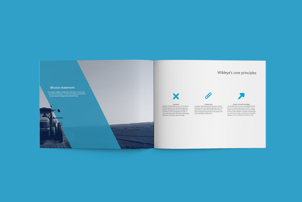
The first step was to define all aspects of Wildeye as a brand, to define its brand truths and what makes it unique on the market place. Refining the mission statement and expressing the company’s core principles helped guide the rebrand and will channel future growth.
The logo needed to be simple to reflect the ease of use of Wildeye’s technology. It was then paired with a fresh colour palette. The W references the fluidity of water channelled through irrigation canals and pipes.

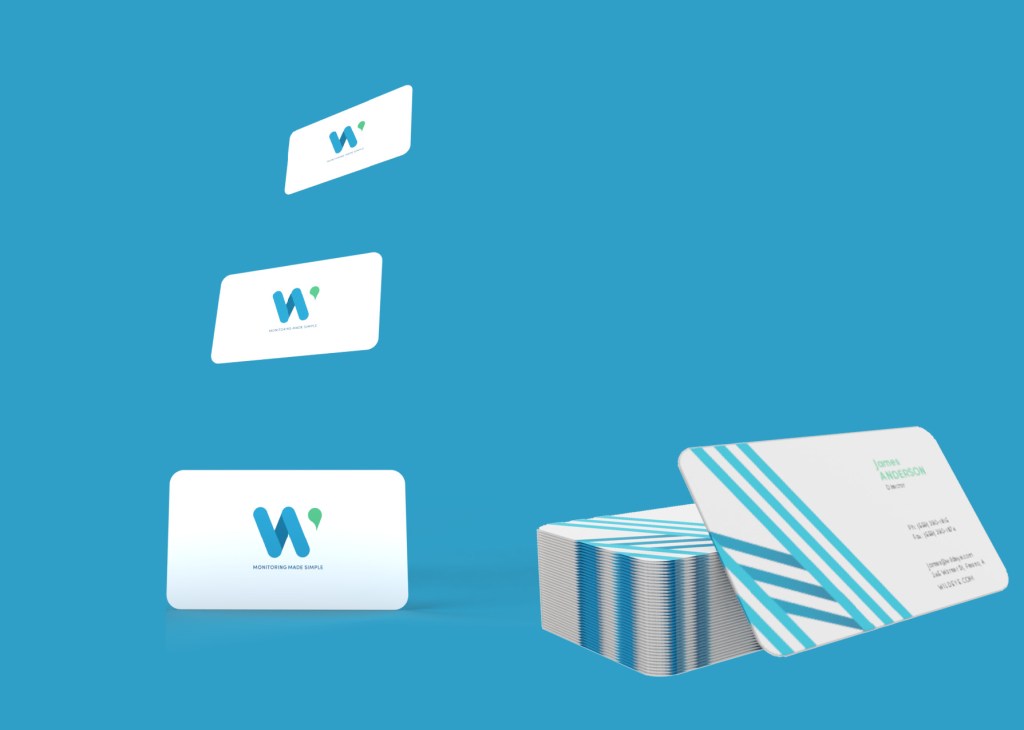
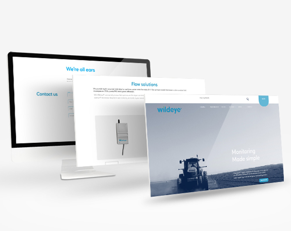
The visual identity combines a customized rounded typeface and dynamic data patterns that reference elements of engineering and technology. The result is a dynamic, innovative brand with scalable applications across digital and print media.

The brand’s tone of voice guided the copyrighting: “Monitoring made simple” serves as an umbrella for the whole offer as well as being a diffentiator from the competitors’ clunkier solutions. It is a motto that speaks equally to Wildeye’s broad array of target audiences.