Project Scope:
Branding
Packaging
Komo is a personal project that articluates my love for making ice cream. The brand name draws inspiration from Lake Como while the tagline, ‘Living the sweet as life’, reimagines la dolce vita through a New Zealand lens.
The brand started as a daydream as each summer, my house becomes la casa del gelato. I picture sunlight glinting across the water, rides on a Cadenazzi boat, and enjoying the warm sun lounging on the lawns of a Palazzo. That vision of luxury and sensory delight became the essence of Komo: a brand that celebrates simple pleasures as a luxurious experience.
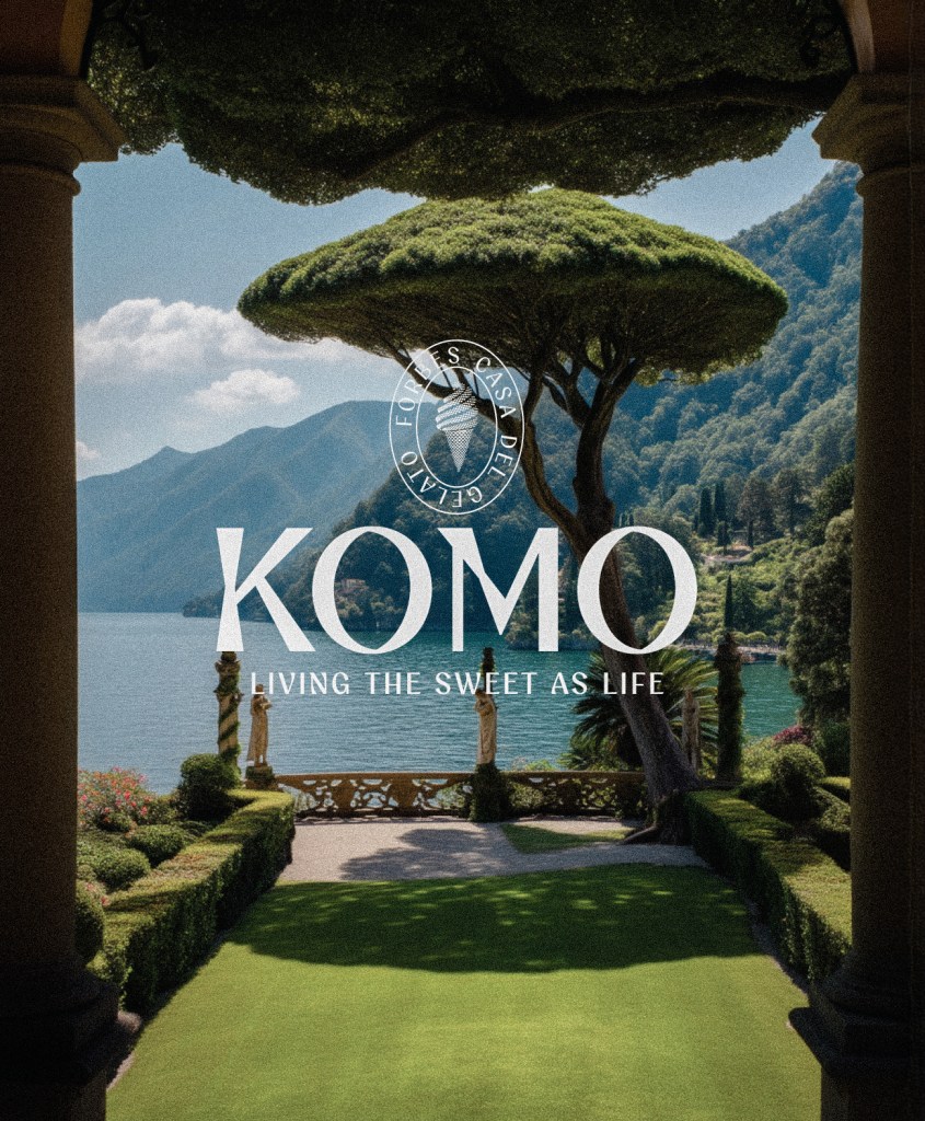
Faxi, the brand typeface, reflects this duality : balancing architectural precision with expressive artistry. It is clean, modern and legible while its crafted details add sophisitication and individuality.
The colour palette draws from the landscapes of Lake Como and Auckland, combining deep, saturated hues with bright tones to evoke both the richness of Lake Como and its palazzi and the breezy lightness of the Pacific.
